1. Define Project Goals and Challenges
Project Goals:
-Develop an ordering and payment app for Conservatory Coffee, a local coffee shop
-Develop an Information Architecture strategy, UX, and interactive prototypes
Project Challenges:
-develop an Information Architecture that allows for the future expansion of menu offerings
-Structuring information and successive choices in nested menus
-design a comfortable but efficient ordering sequence
2. Foundational Research
Initial user research consisted of field observations and interviews with existing customers at Conservatory Coffee, usability studies of their existing ordering platform, and a competitive audit. On-site observation and interviews revealed two main user groups: those who are in a hurry and those who are not. Right now, Conservatory operates one system for ordering online and picking up that is not well suited to either and creates conflicts between main user groups. Streamlining the ordering and pickup for hurried users emerged as a critical working point.
Lucia
Age: 26
Education: BA, Humanities
Hometown: Culver City, LA
Family: Single
Occupation: Production Assistant
Lucia drives to work every day, sometimes by herself and sometimes with two coworkers who live nearby. They are frequently running late. They stop by for coffee every morning, pull up the car in front and hop out, and are frustrated when the coffee isn’t ready yet.
Arthur
Age: 81
Education: BA, Business Admin
Hometown: Marina Del Rey, LA
Family: Partner
Occupation: Retired
Arthur retired from the movie business a few years ago. He likes walking to the coffee shop to get a late-morning coffee. Sometimes he chats with the staff, sometimes he meets a friend. He wants to get out of the house and talk to people; he wants to feel connected.
Pain Point #1
Customers are frustrated when they order online but still have to wait in line.
Pain Point #2
Potential customers are scared away by the unpredictability of the wait - some days there’s a long line, some days there’s no line at all.
Pain Point #3
Conservatory’s existing ordering interface is designed for desktop and difficult to navigate on mobile.
Competitive Audit: I looked at these companies’ web and app products and evaluated them along a couple parameters including: How do they organize information? What do they promote on home pages? How do they define their value proposition? What works well and what do I think needs improvement?
3. Information Architecture
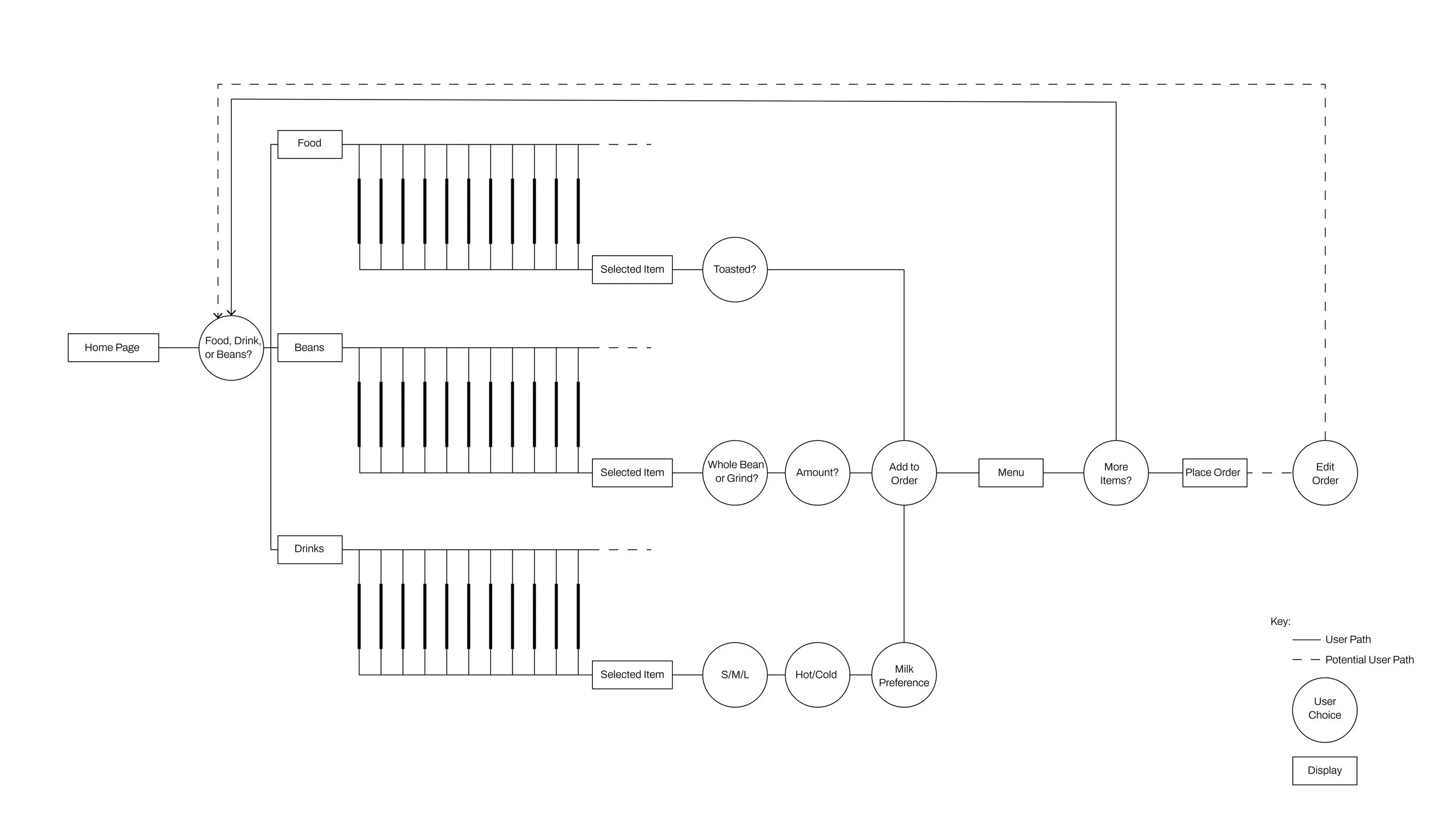
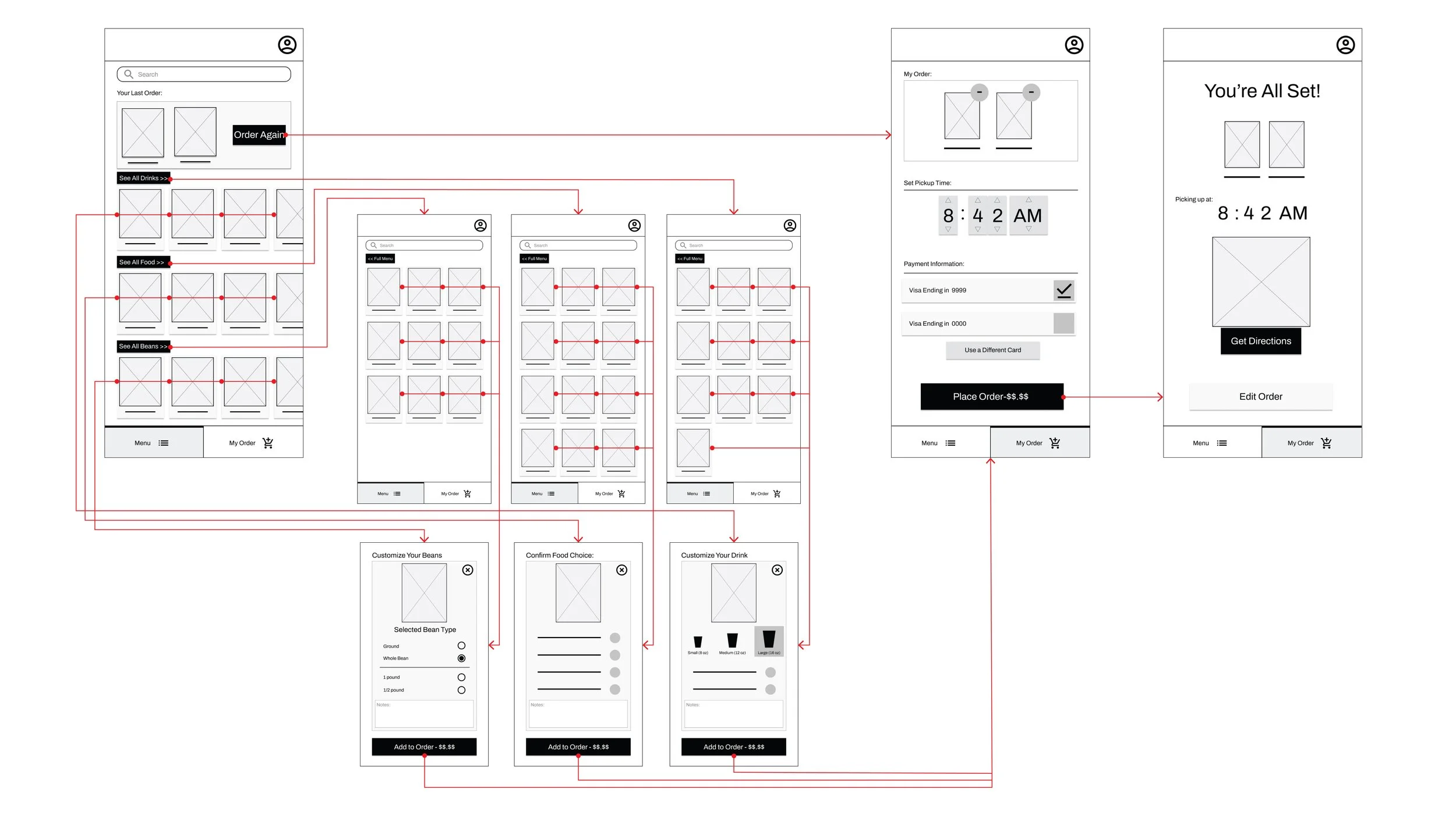
Working with the menu at Conservatory, I structured a tree diagram of user flow and choice options.
4. Wireframes
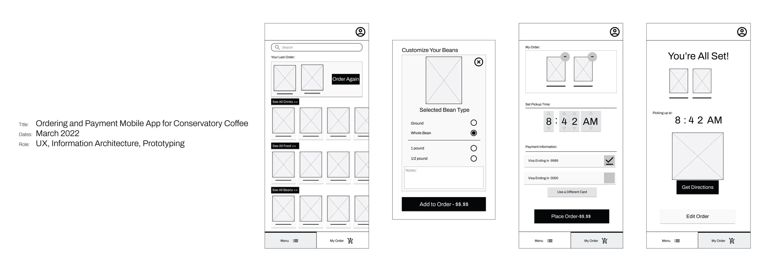
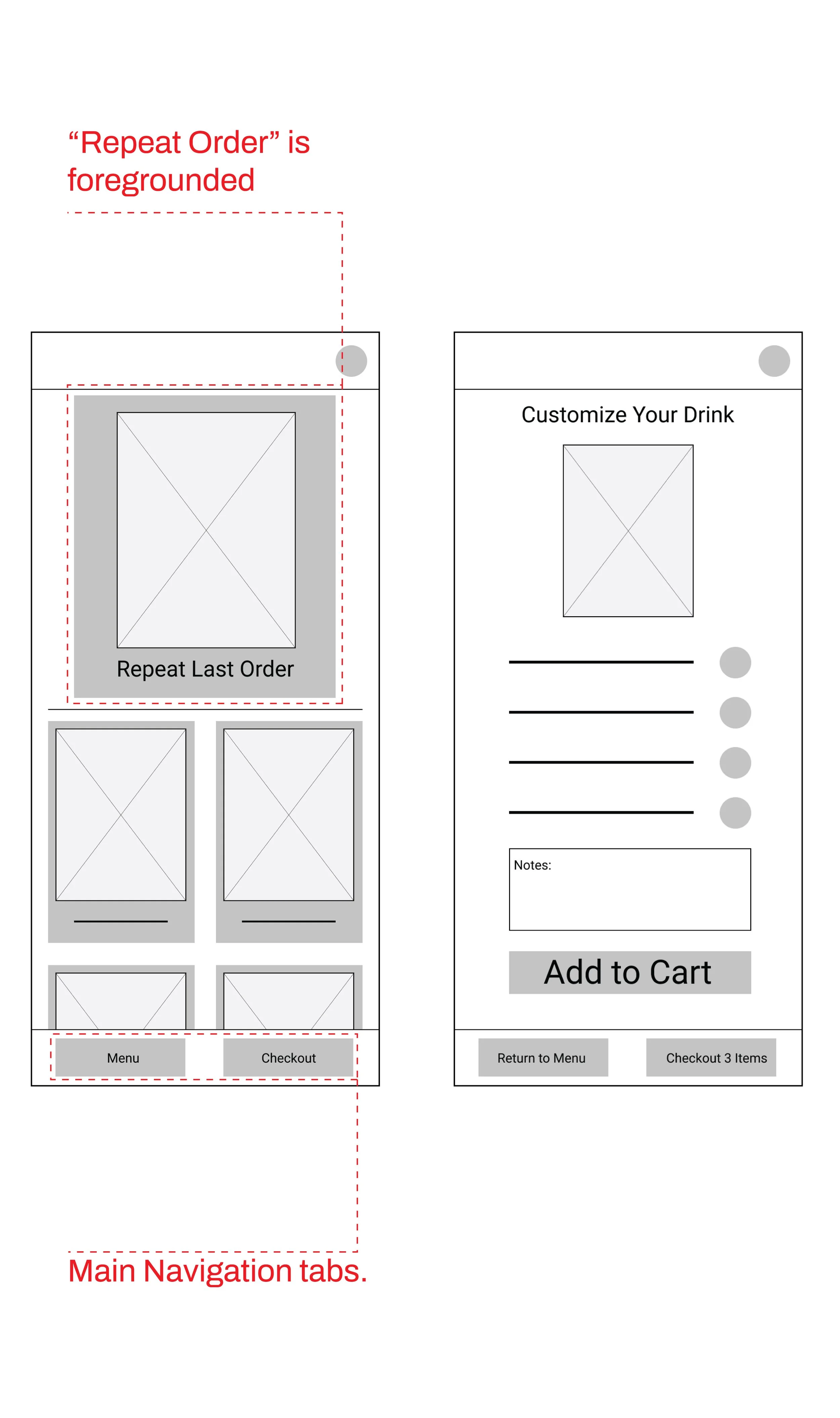
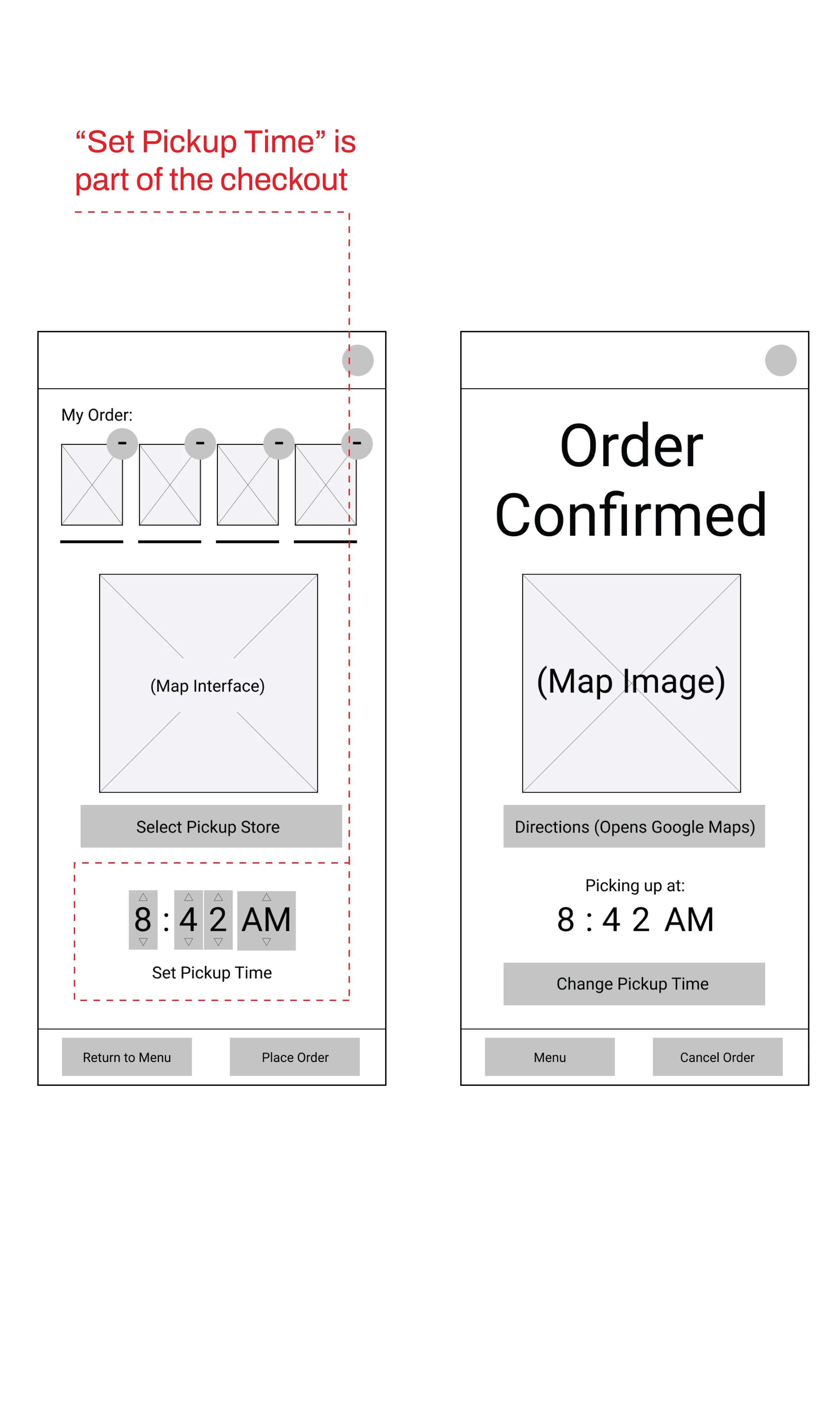
One big idea moving from the research phase into wireframing was the necessity for a “Schedule Pick-Up” feature. A second was the “Order Again” feature - especially important for users who are stopping by Conservatory Coffee as part of their regular, hurried, morning routine and tend to order the same thing every day.
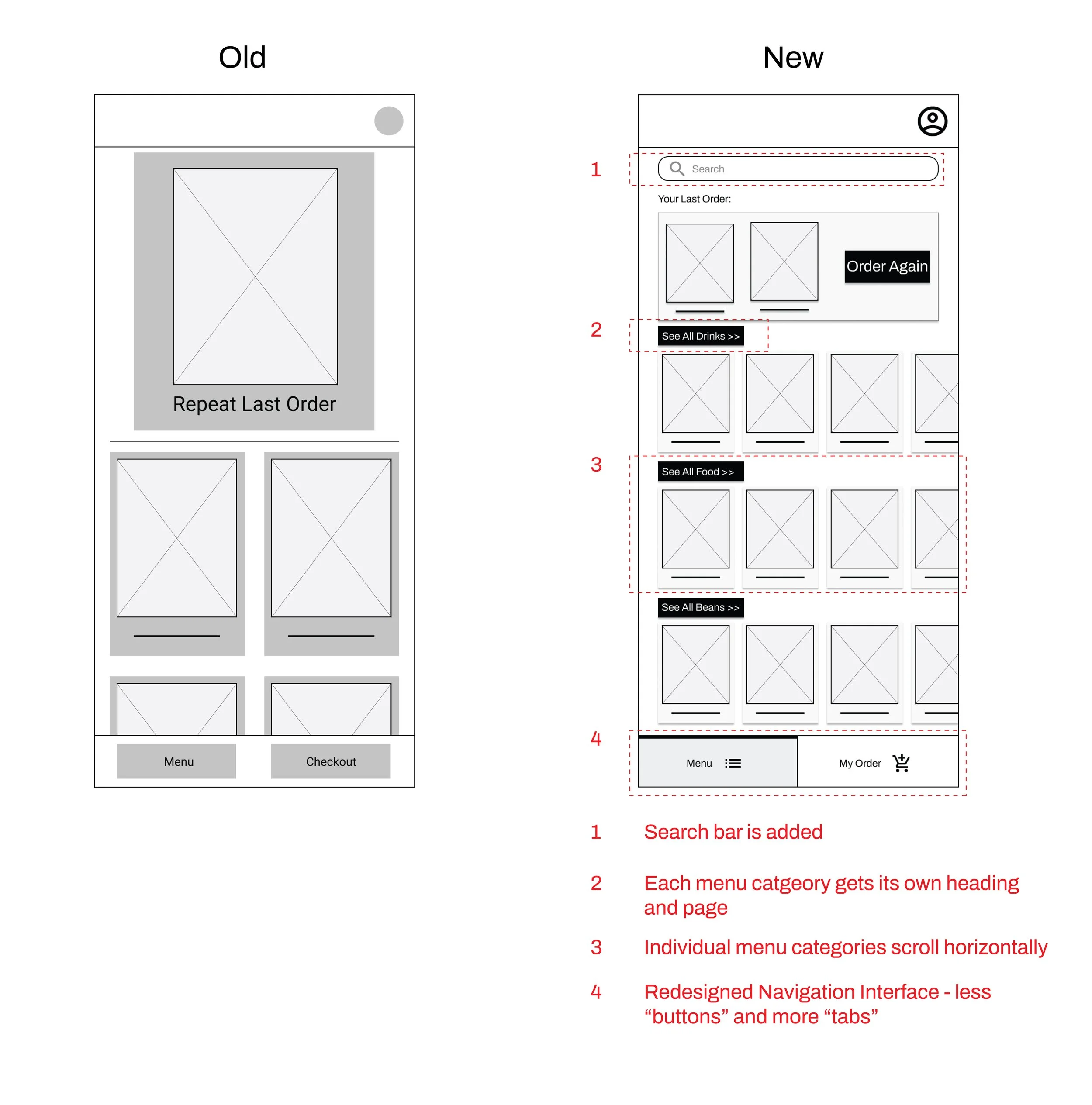
Working with the information architecture and the insights gained from the research phase, I split the main navigation into two: the “menu” and the “checkout/order”.
5. Usability Studies
Adding basic interactivity generated a working prototype that I used in a series of usability studies.
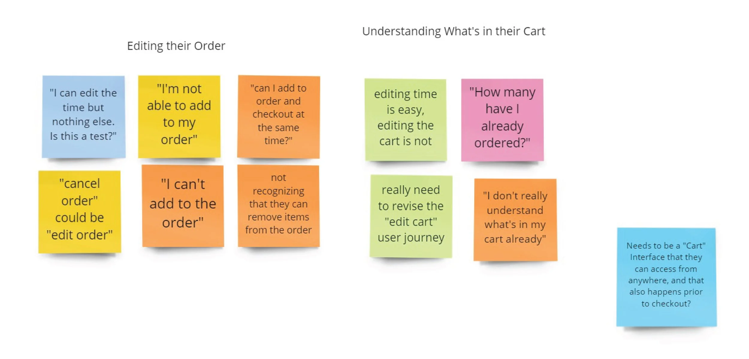
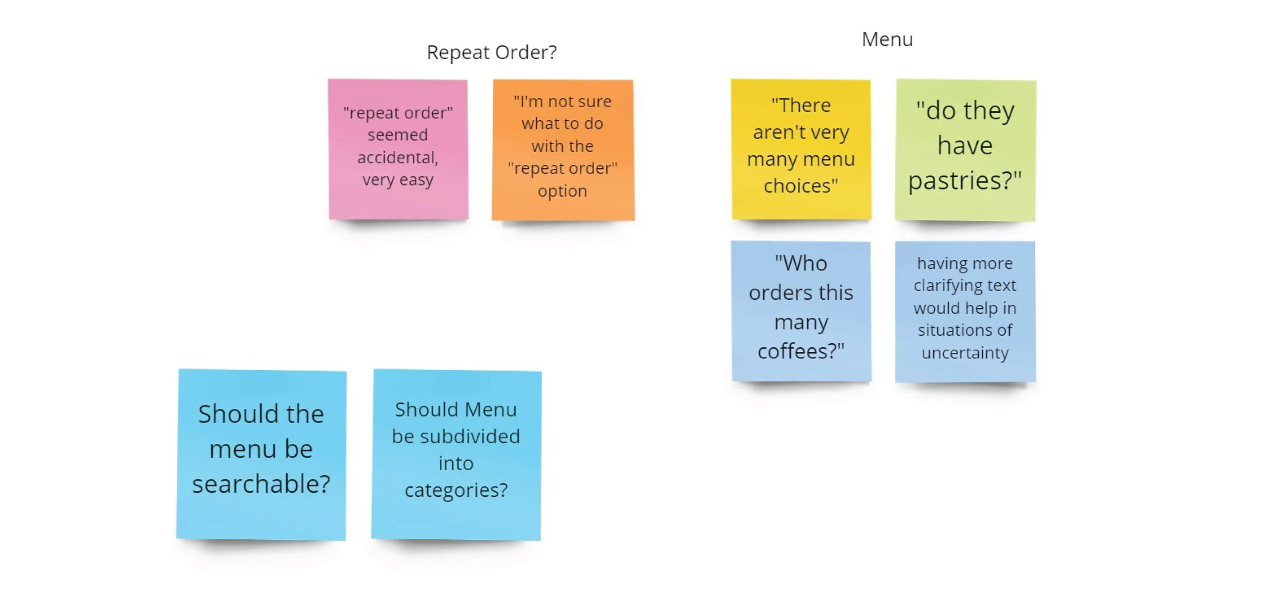
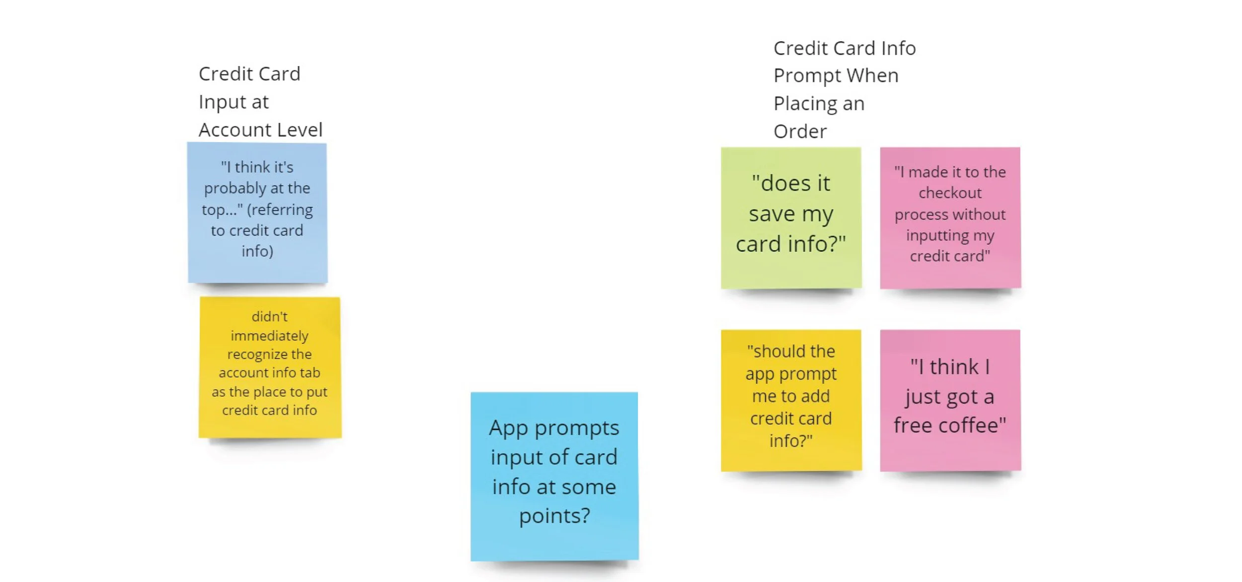
Initial usability studies indicated major concerns including that users didn’t know what was in their cart, and that they had difficulty understanding payment options. In the second round of usability studies, users weren’t able to navigate menus efficiently, and were slightly confused about what they were supposed to do immediately after opening the app.
Usability Study Insight #1:
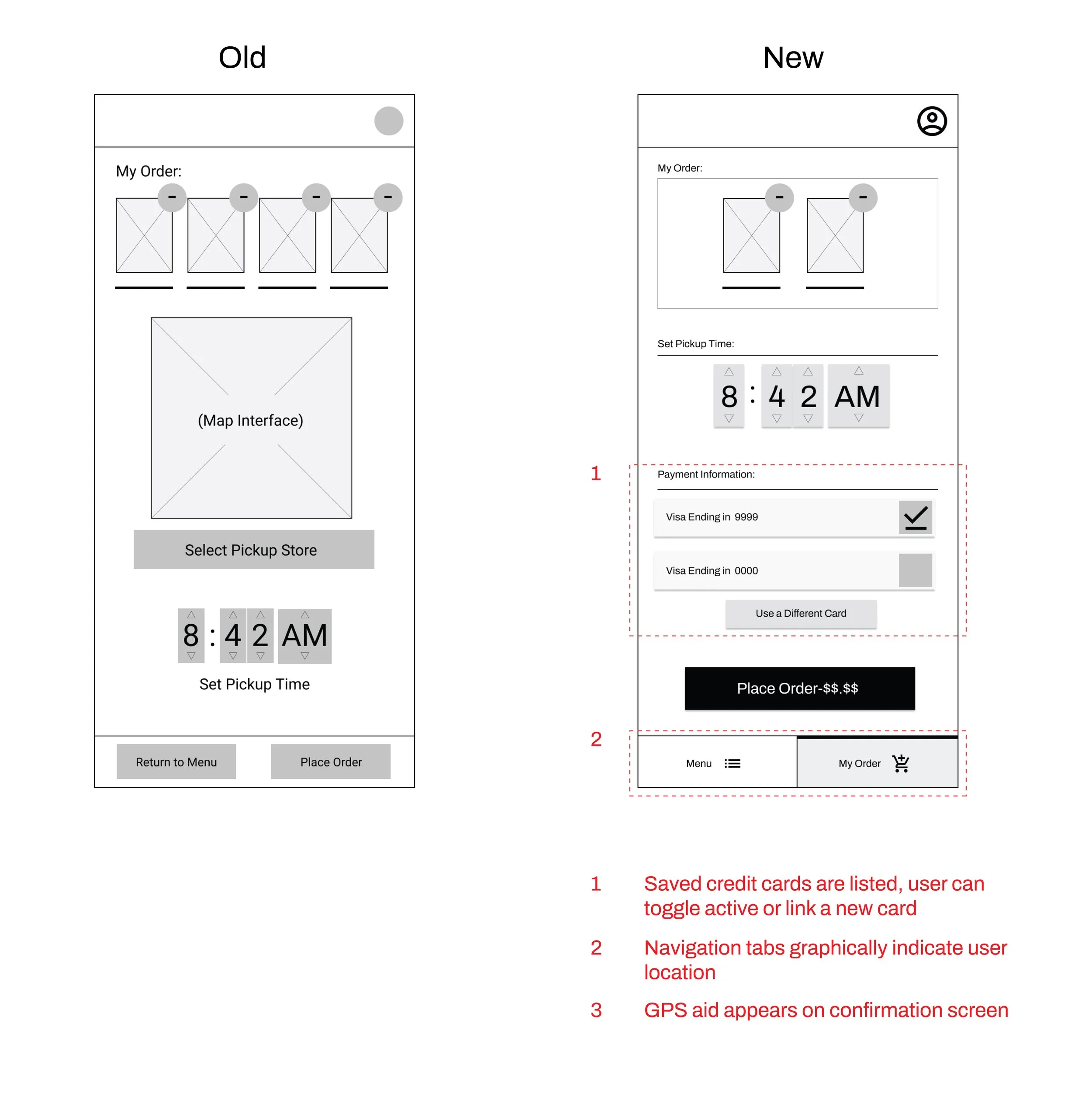
There needs to be a “Cart” interface that users can access from anywhere, anytime
Usability Study Insight #2:
The menu should be subdivided into categories, and searchable.
Usability Study Insight #3:
Users need to see the credit card they are using, and be notified of a successful purchase.
Usability Issue # 1
“What’s in my cart?”
Usability Issue #2
“How do I get back to the menu?”
Usability Issue #3
“Did I just get a free coffee?”
6. Revising the Wireframes
Revisions to the “Menu” Tab
Revisions to the “My Order” tab
7. Refining and Animating the Prototype
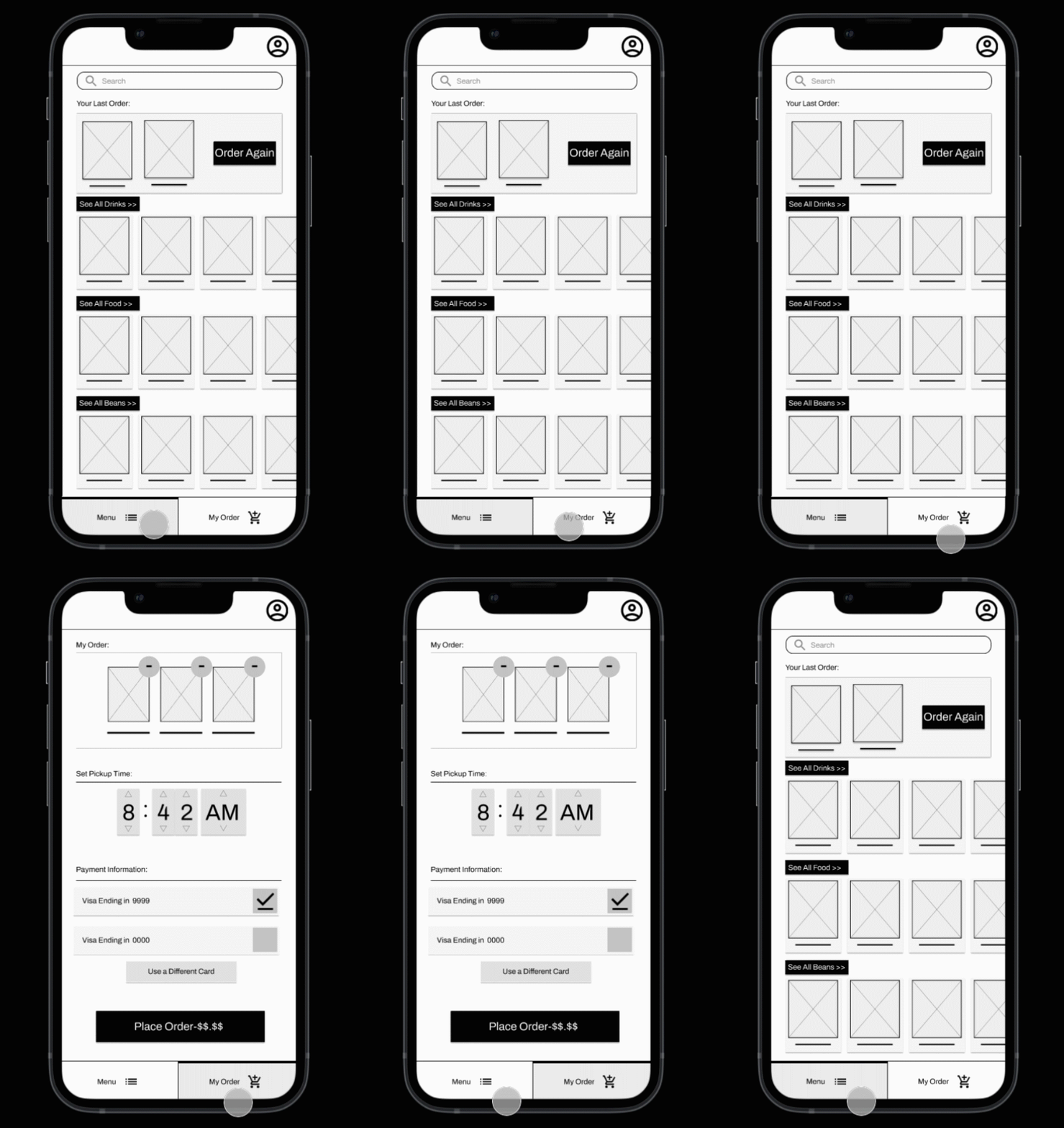
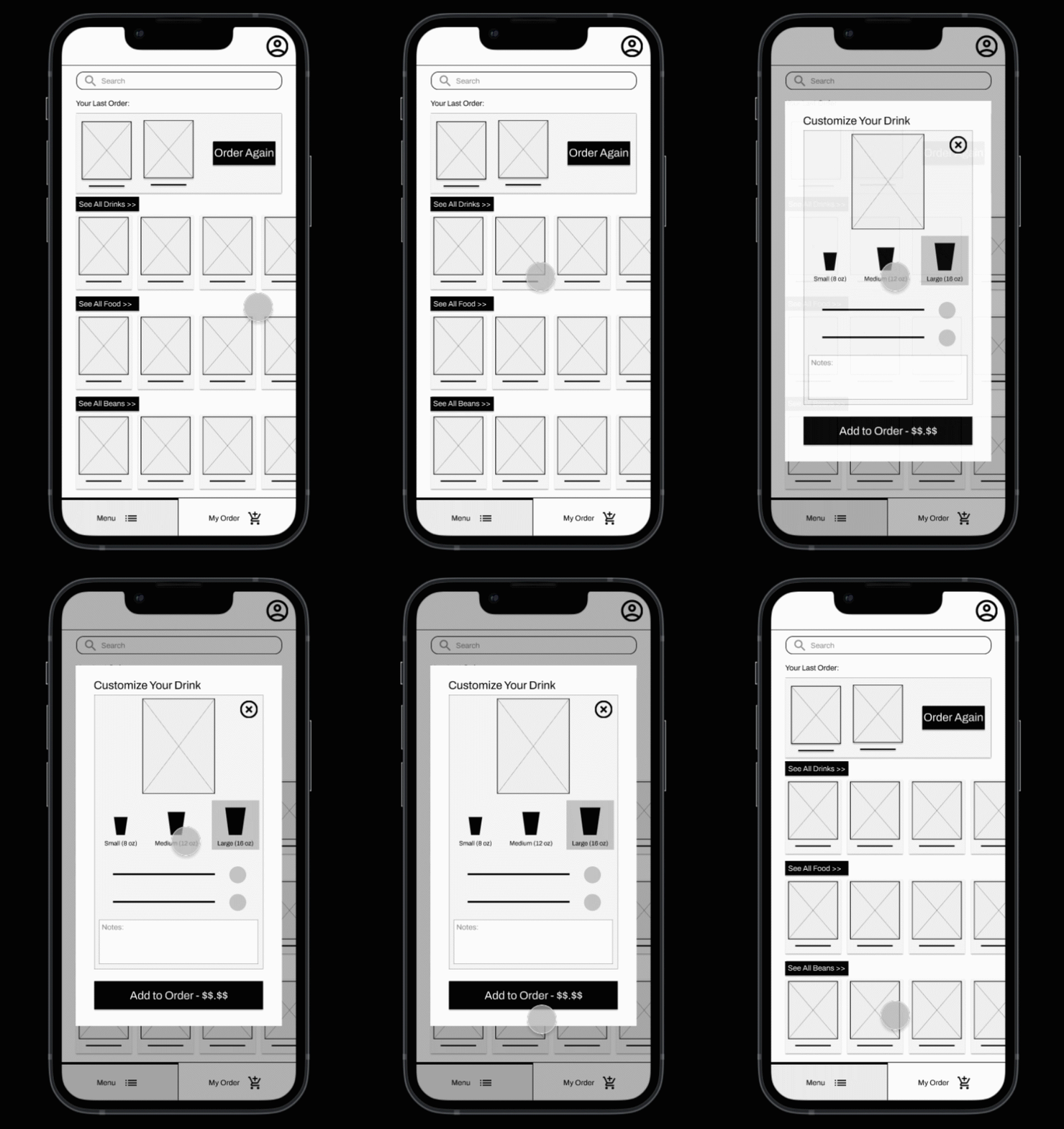
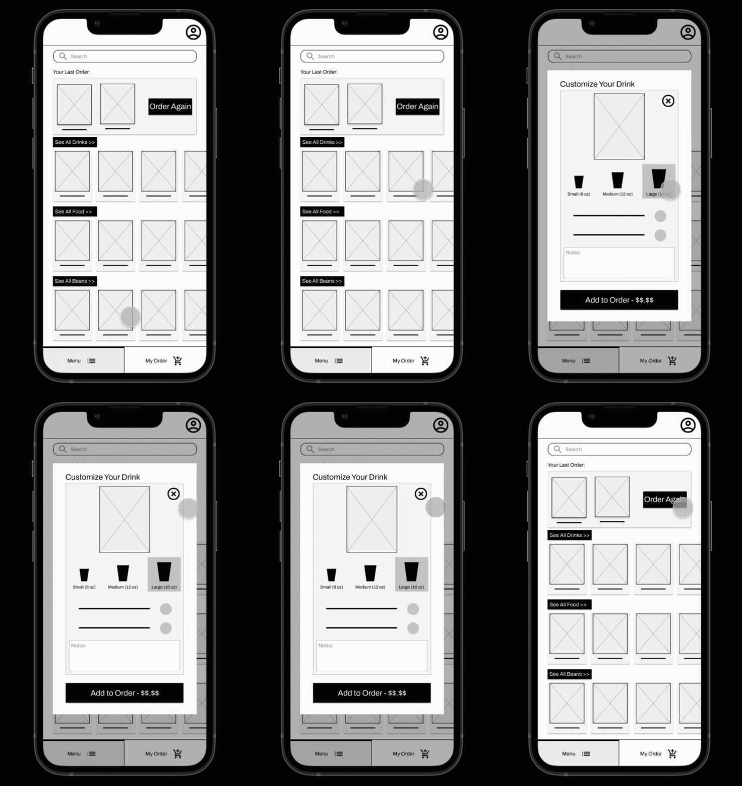
The spatial coherency of the dual-tab navigation is reinforced with animation; right and left move-in animations take the user back and forth between the “Menu” page and the “My Order” page.
Click here to view the prototype. (Opens in a new tab.)
Here, spatial coherency is again reinforced; items that are X-ed out dissolve into the background, while items that are added to the user’s order slide right into the “My Order” tab.
8. Takeaways
I learned a lot about Figma - especially its animation and interaction capabilities. And, again, that there’s nothing like a round of usability tests and iterating to help you figure out what direction to take your project.

