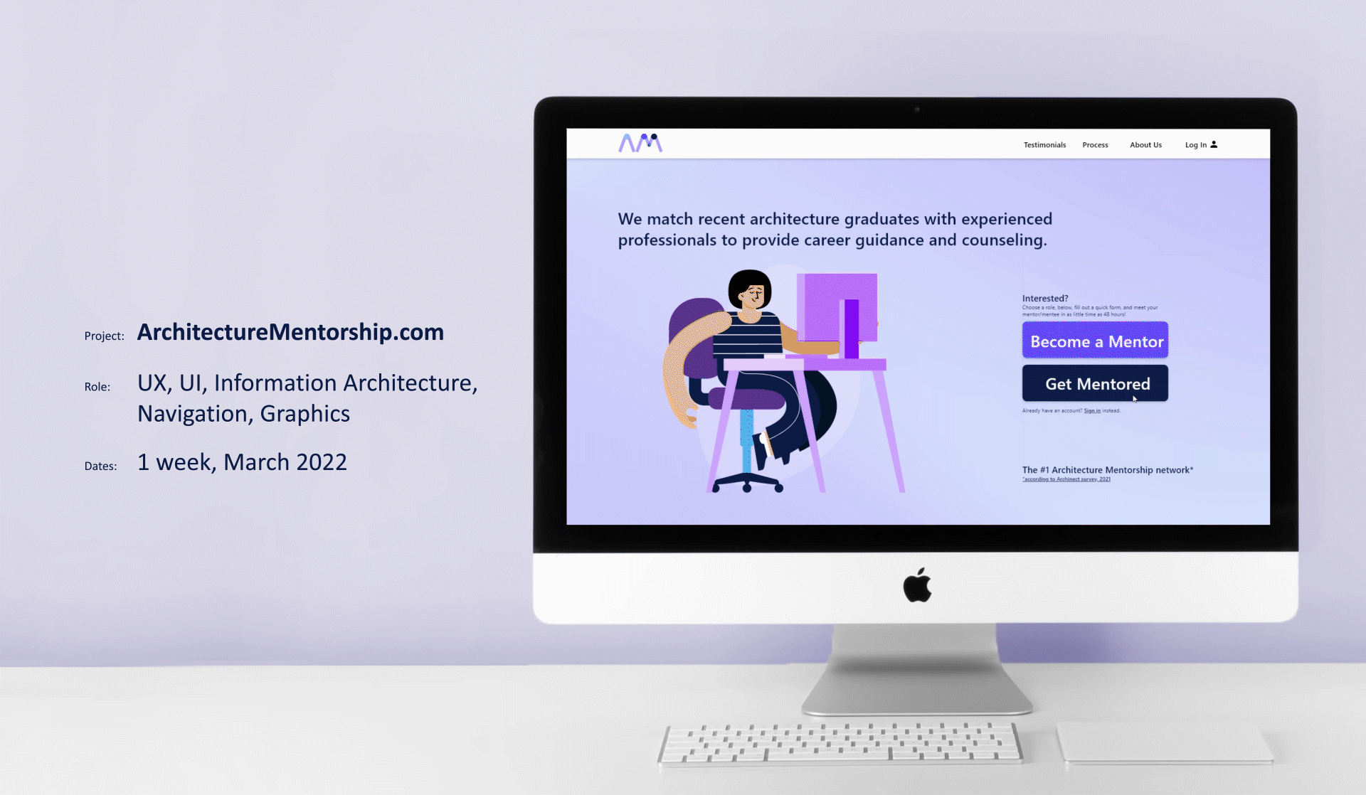
0. Final Prototypes
Click here to view the final desktop prototype. (Opens in a new window.)
Keep scrolling to see the process.
Project Goals and Challenges
Project Goals:
1) Design a signup flow for an architecture mentorship service
2) Employ a user-centered design process to develop the MVP, defined as a successful signup flow.
Project Challenges:
1) Design a responsive, web-based signup flow for desktop and mobile
2) Develop an easy-to-navigate UX
3) Develop a familiar, comfortable UI
2. Foundational Research
Foundational research here consisted of a series of competitive audits as well as user observations and interviews. The competitive audit revealed that there are no direct competitors but several indirect competitors including LinkedIn, WayUp, BetterUp, and TheMuse. I studied these services’ offerings and advantages, focusing specifically
on their signup flows. I looked at registration options they provide, visual cues they use, and common patterns.
Out of my user interviews I developed three user personas, below:


User interviews foregrounded three primary concerns:
“How does it work?”
“Who uses this?”
“How do they match mentors?”
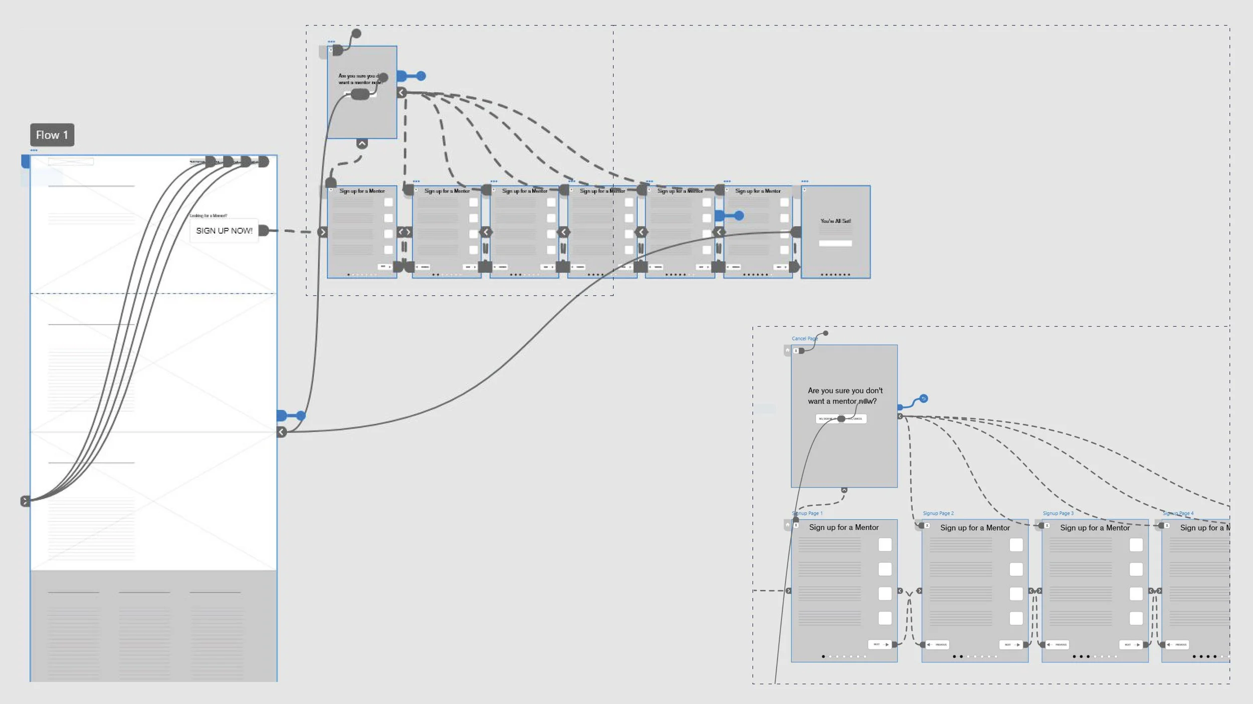
3. Wireframes and a Prototype
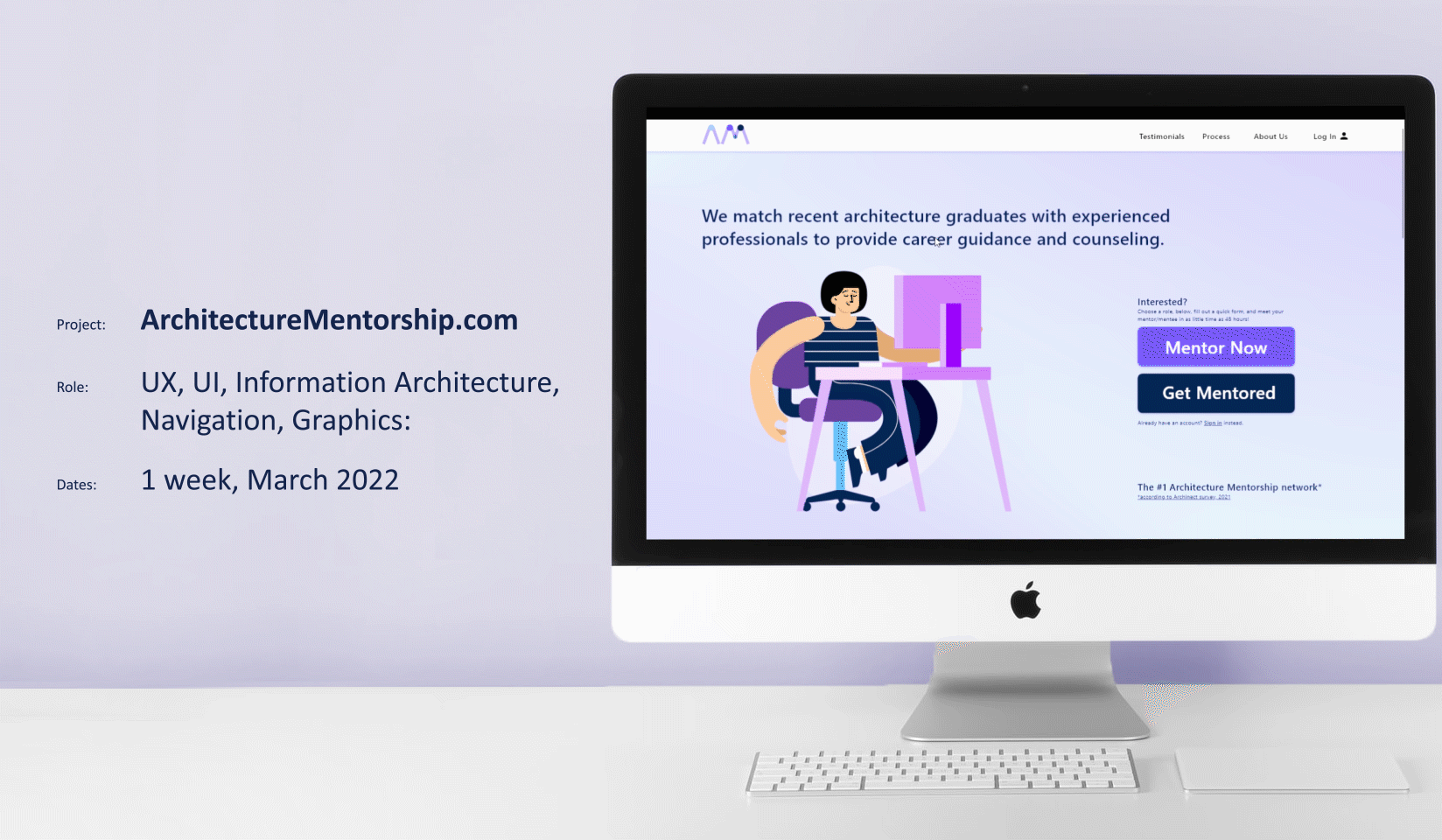
My early wireframes directly address these concerns with an easy-to-navigate, scrollable landing page. The landing page is broken into 4 sections: a top section that fulfills the primary user flow and features a “Sign Up Now” button, and then one section for each of the primary user concerns unearthed via user research.
Top-bar navigation reinforces the landing page structure.

The landing page is interactive in two primary ways.
1) The “Sign Up Now” button launches a user registration sequence.
2) The fixed top-bar allows users to easily click to navigate between different sections of the page. Users also are able to scroll up and down the page.
A key feature seen in the signup flows of multiple indirect competitors was the progress indicator. The progress indicator lets users know how far they have come and how many pages of the sign up form remain to be filled out.
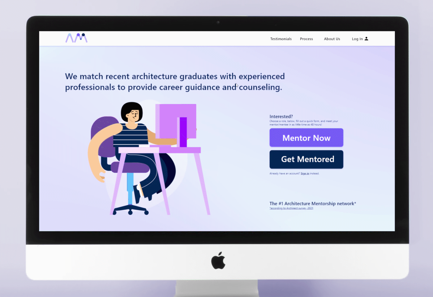
4. Mockups
Foundational research yielded a a macro-scale layout and wireframes. Once I had added basic functionality, the next step was a round of user testing.
User testing revealed that the sections of the homepage should be more separately articulated from each other, and that the site header should be fixed as users scroll. Testing also affirmed that the basic signup flow seemed to work, but suggested further refinement was necessary to confirm usability.
Click here to view the final desktop prototype. (Opens in a new window.)
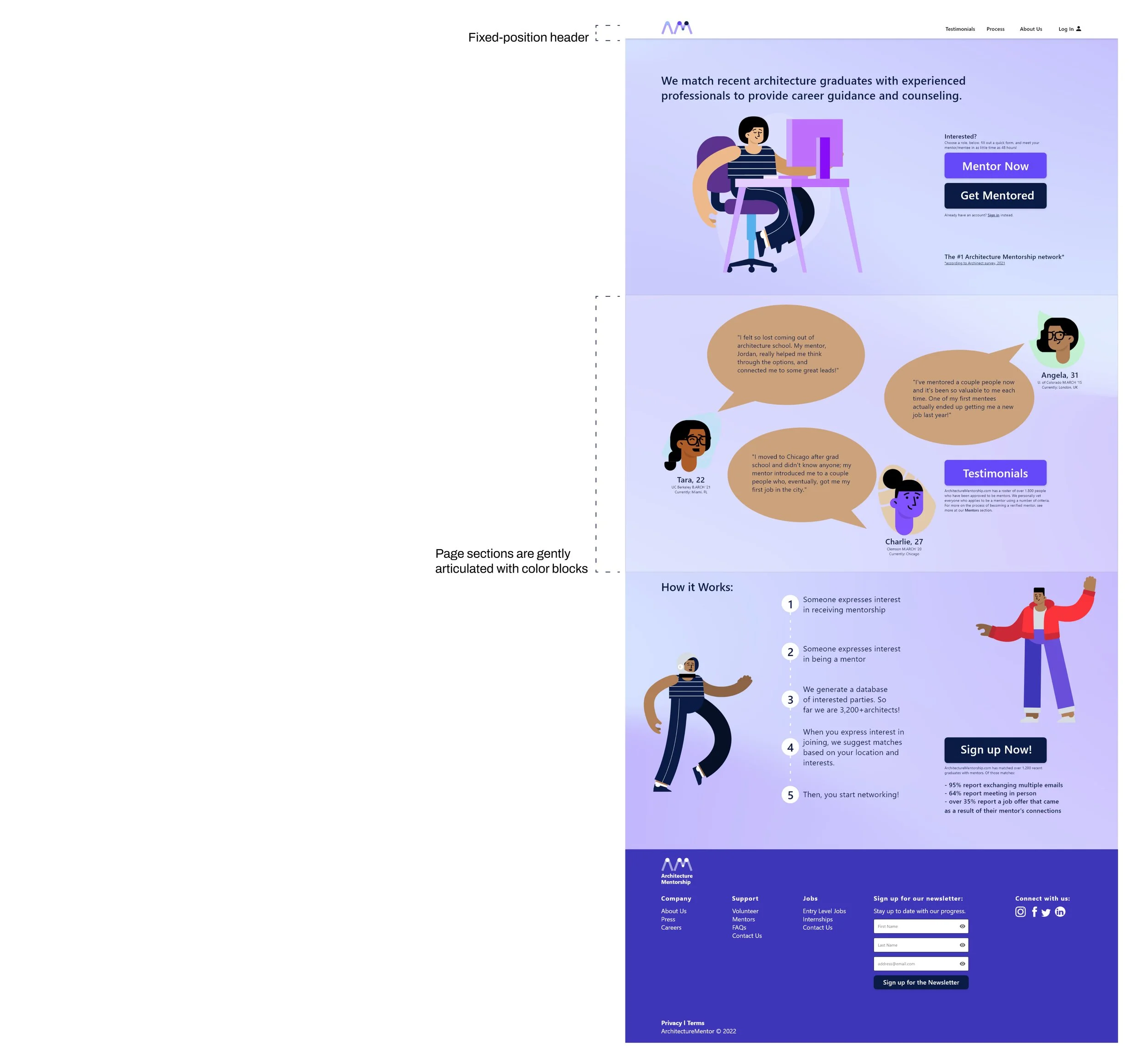
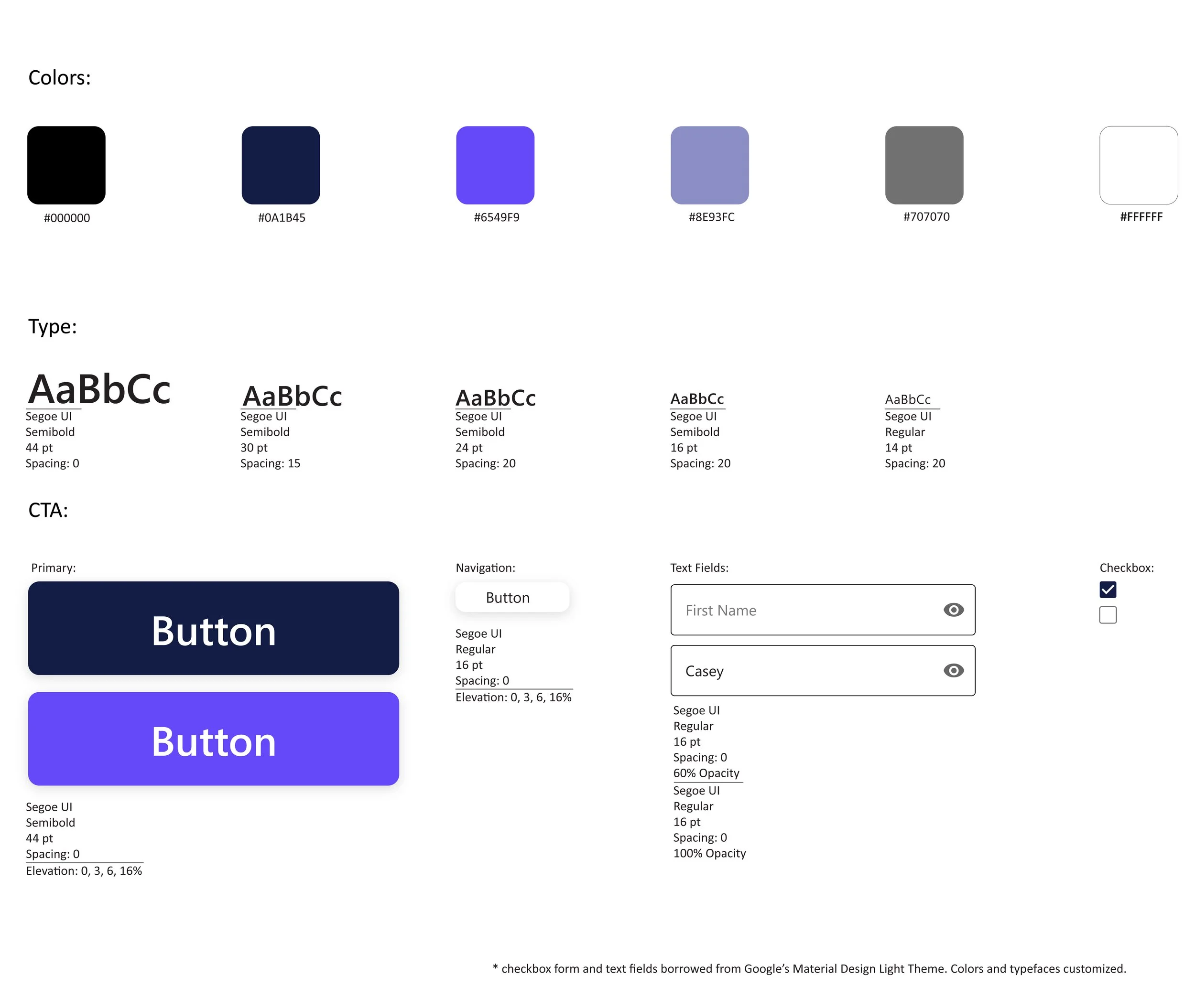
A critical tool in developing mockups was the style guide. The selected color palette seeks to be friendly and relaxing, while buttons and interactive elements are large, and, where applicable, refer to web standards (i.e. Google Material Design) to ensure familiarity. The color palette and pairings all adhere to WebAIM WCAG standards.

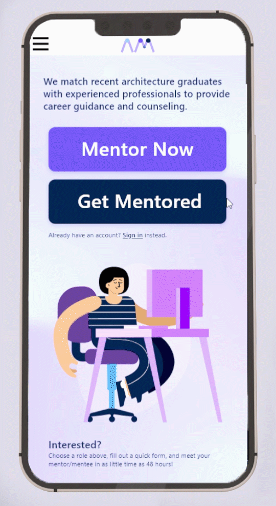
5. Making a Responsive Site
Key aspects of the desktop site remain: straightforward navigation, progress indicators and brand identity are consistent and carry across into the mobile version of the site. While elements are re-sized for the mobile interface, brand identity remains consistent.
6. What I learned
Adobe XD! Its built in workflows, and some of its advantages and disadvantages (especially as compared to Figma.) During this project I was introduced to WebAIM and WCAG accessibility standards and how important they are for ensuring a usable and accessible product. I regularly consulted WCAG standards while I was developing my design system and style guide.
I also learned about the idea of the minimum viable product, and how important it is to set targeted design and development goals.
And, lastly, for the umpteenth time, I was reminded of the power of user testing and iteration.